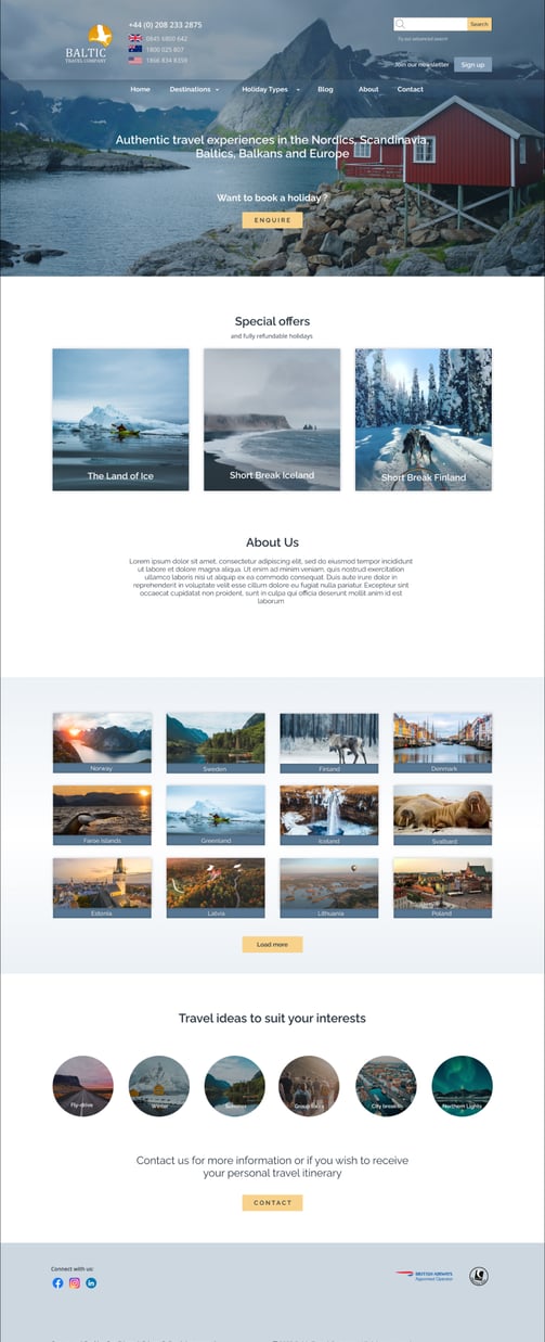
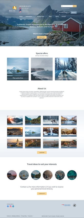
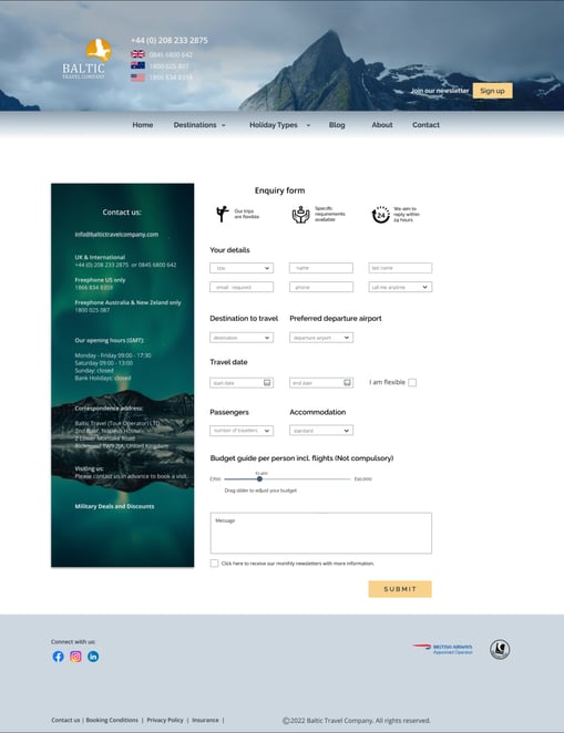
London based company's website was built a while ago, and it is in need of new design and structure change. The main reason is to improve the user experience and generate more leads.
Research | Wireframe | User Flow | User Persona | UX/UI Design
31 px A Visual Type Scale
25 px A Visual Type Scale
20 px A Visual Type Scale
16 px A Visual Type Scale
12 px A Visual Type Scale
31 px A Visual Type Scale
25 px A Visual Type Scale
20 px A Visual Type Scale
16 px A Visual Type Scale
13 px A Visual Type Scale
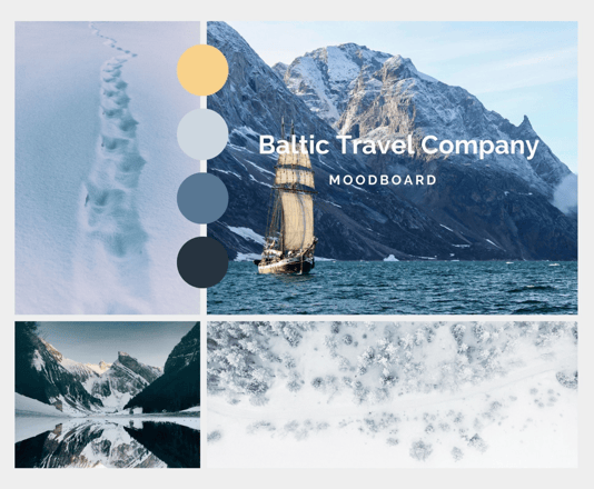
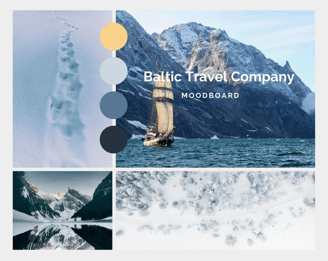
For this moodboard designed for a Baltic Travel Company, I chose a palette of blue cold tones to evoke the serene and refreshing essence of Nordic destinations—reflecting their pristine landscapes, icy waters, and cool climates. To balance this, I incorporated soft pastel yellows, symbolizing the magical glow of polar days and the warmth of endless summer sunlight. Together, these colors create a harmonious blend that captures both the tranquil and uplifting experiences unique to Baltic travel.